Monday, December 10, 2007
One Shot
This was the attempt at the one shot piece of work, as a group I think we all decided that we had rushed this and not planned it through properly. Debs made some good points when talking about where we went wrong, she said we should have experiement with depth of field and taken into account the rule of thirds, as well as this the major point was about how we should have used a neutral density so that it wasnt so bright and this would have created a better feel for the shot. I think the task was still helpful even though the end result was not of a good quality because I believe we all learned something through the course of it.
Group Hannibal Edit
In this group task we had to take footage from four cameras and edit them together in whatever way we wanted, it was helpful that we had a video with all four camera angles on as well so we could watch through all the footage which had been filmed at the same time. The editing went fairly quickly as we were able to line up all the footage on different tracks in premiere, along with the four shot footage.
Sunday, December 09, 2007
Music Soundtrack
The music i created involved two tracks, one was something i created using fruity loops and the other was a guitar track that i recorded from one of my mates (Leon T. Allen) but we decided not to use it because we felt that it didnt fit with the general overall feeling of the documentary, and so we used the music that i created and i believe that it works very well with the entire documentary.


Friday, November 30, 2007
Saving Sound
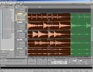
After we had gone to the centre to record our footage we discovered that the audio was very bad due to us not using the correct microphones, this meant that our footage was unusable. I took the audio to see if it could be recovered and i found a good way to do this in a program i have called adobe audition, the program allowed me to take a piece of the audio where there was no talking (i.e. just the background sound) and analyse the frequence, after doing this you could select the whole track and take that frequencey of the background sound out, leaving the audio with just the talking.

Thursday, November 29, 2007
Documentary Questions
These are the questions we have decided to ask ash's uncle:
1)What is your name?
2)Where were you born?
3)How old are you?
4)How long have you lived in Nottingham?
5)How did you get into sports?
6)How did you get into coaching?
7)How long have you been coaching for?
8)How long have you been coaching at this club?
9)When and why was this club opened?
10)How do you think this benifits the community?
11)Is the club sponsored or does it recieve funding?
12)Does your family help you with the scheme?
13)What age group do teach?
14)What do you teach and achieve in the 2hr sessions?
15)Is there a summer scheme?
16)Is this your full time job?
17)What do you enjoy about working at the club?
18)How do you think the club can be improved?
19)Did you have a similar scheme when you were younger?
20)What other interest do you have?
21)Who or what inspires you?
The Editing Process

I think this exercise showed how powerful editing can be and how much control the production and editing teams have over the final piece. In my piece I took the advert for Martini in which a man in a black suit arrives on a boat and goes and takes a drink to a woman, later on in the scene he is driving a car. Through editing i change the scene so that it seems as though the man is stealing bottles of Martini and then running away, jumping on a boat and then escaping in a car.
Wednesday, November 28, 2007
Documentary Research
As part of my research i watched a four minute documentary that i discovered on youtube. I felt it was relevant to our project because it involves a community project and is about a house that has been turned from a dissused building into a commmunity center.
Small Screens
Let's Play
Jo Berry
This series of experimental animated drawings developed from Jo's interest in creating digital drawings with movement. The computer as a drawing and design tool allows incredible clarity and precision in creating 'hybrids', new forms through amalgamation.
In different short animations we see experimental forms bending, flying and turning over the screen.
I believe this piece of digital art was trying to play with time and space, stopping reality in one place and showing a singular piece of time, almost like a more complex version of a photograph, and i thought it was a very interesting concept.
Tether Festival
Tether Festival presents animations and video shorts by artists and filmmakers from around the UK such as a hand-drawn battle of wits between Theresa Wrigley and Chie Hosaka.

'Air Condition' - Ezer Shniderman


Wednesday, October 24, 2007
Iconography
For this exercise we were told to think of a character related to a certain genre and shoot a scene only using one shot and it should be no more than 30 seconds long.
I would class our chosen genre as drama, this is because it is focusing on human emotion and contains emotional themes.
In our group we split ourselves up into different roles;
Me - Art Productions -props, costumes, locations and makeup
Glyn - Director - scripting, frame forge and storyboarding
Ash - Sound - recording live and non-live sound
Sid - Camera - equpiment
As part of my role i scouted out different locations that could be used in the graveyard and took pictures as shown below;


 As the scene is about death we want the colours in the scene to be grey and dull to give conotations of death and after checking the weather forecast ive found that it will be 'prodimiantly cloudy' which will be perfect for the scene, but we will have to prepare ourselves for rain.
The scene has been influenced by an episode of scrubs. In the episode Dr Cox's friend has died but he still believes he is alive until he realises he is at his funeral, if you havent seen it id definatley reccomend watching it cause its an awesome episode
Friday, June 01, 2007
Idents Project Evaluation
Evaluation Report
In this essay I will evaluate my Identities project, for which I chose to do E4; I will evaluate my research, project management and the finished product.
I chose to do the E4 project because I felt that it was something I already knew about in detail through past experience which has been approximately four years.
Through my research I concluded that E4 was a freeview and digital tv channel and was a product of the Channel 4 company. The programs shown include a lot of American import programs such as Friends, E.R., The OC, Smallville, The Sopranos, Desperate Houswives and Scrubs, as well as some British programs like Hollyoaks, Big Brother and Wife Swap.
A music program created by E4, named ‘E4 Music’ has also been running since August 2005, everyday in a 6am to 2pm time slot everyday and is very ‘viewers choice’ orientated.
E4 also has ‘First Look’, an incentive to its viewers where a program is shown before it is aired on C4 (Channel 4), although this is only with Hollyoaks and Big Brother.
Another feature of the channel is the ‘Timeshift’ channel called ‘E4+1’, this channel shows what was on E4 one hour ago and therefore useful for people who miss programs or want to watch them later.
Further to my research on the background information of the channel, I decided to produce a questionnaire in which my main aims were to find out the target audience of E4 (i.e. age group and gender), find out what people knew about E4 and to find out why they liked it.
My questionnaire consisted of nine questions in total, as well as a starter question in order to decipherer whether or not to continue the questionnaire.
After I had used my questionnaire to interview people, I drew some research conclusions; these were that the target audience were 13-30 yr olds, both male and female. These people like the choice of programs, especially the vast array of American import programs.
More research led me to discover previous E4 promotional campaigns, although these campaigns were only used on E4 and were not used for advertising purposes (e.g. posters, billboards, etc). The trailers shown on E4 “often make use of dry humour and phrases which at first do not appear to make any sense”[1], some of the phrases used include; “In 1884 we invented music telly. We just didn’t bother telling anybody”[2] and “Second chance Sunday – not just a bunch of repeats – honest!”[3]
The material that I researched enabled me to make decisions on how I wanted to re-brand E4 and how I wanted to achieve this re-branding, although I firstly needed to discover and research re-branding in able to fully achieve this.
Looking at how brands are viewed and different thoughts behind a successful brand helped me discover that brands are unique and differentiated; they maintain personal connections in the sales process, whilst associating themselves with a clear set of values, as well as fulfilling a need or expectation for the target audience[4].
A quote that I found helped me realise success behind brands was “Brands are more that logos. Many elements combine in a brand to generate an emotional bond with a customer. Brands are about personality”[5].
Once I had researched I decided that I would produce six stings, three for E4, three for E4 Music (with three both split as one animation and two videos), with each being six to ten seconds long and the format would be MiniDV.
The programs I chose to use were Fruityloops for music and sound, Adobe Premiere to edit all the videos, and 3D Studio Max 8 for animation.
The website, I concluded would be separate to the C4 website and would be made user friendly and accessible, I would make this using Dreamweaver.
The poster campaign would follow the same theme as the website in terms of colouring and simplicity, with the aim being to create brand awareness and audience recollection, specifically by creating a slogan or tagline. I decided to use Adobe Photoshop to create them.
Once I had confirmed my intentions for re-branding, I looked at project management and created a schedule of works, one for the stings, the other for re-branding, this was because of different project deadlines.
The final project I produced was a website and three posters. The first of the posters was part of my ‘4 YOU’ concept in which the target audience was included, therefore denoting that E4 was exclusively for them. The poster kept with the original colouring theme for E4 (purple and white) as I considered that they were already associated with the brand.
On the poster, four slogans were used, once again denoting the link with E4, these four slogans were; ‘TV 4 YOU’, ‘MUSIC 4 YOU’, ‘MORE 4 YOU’ and ‘ALL 4 YOU’. In each the slogans the ‘4’ used is the E4 logo, the use of this logo 4 times in the poster was to initiate audience recognition of the E4 logo and in turn create audience recollection in the future for the E4 brand.
The composition of the image is the four slogans from left to right across the poster, each equal in size and inline with each other. The poster is done in landscape; this is so that the text could be created larger and therefore be more eye catching to the target audience. This was the same case for the colours, purple is quite an eye catching colour and has connotations of royalty, spirituality and mysteriousness[6]. The colour white on the other hand has connotations of purity, cleanliness and innocence[7]. These colours go together as white combines well with every colour. The overall composition of the poster allows it to continue the idea of simplicity which this poster conveys well.
The second poster that was produced was a different concept to the previous poster. The poster is in landscape, with a white background and is composed of a slogan as the title which is ‘WATCH E4’ (with E4 logo) and is in purple text. The title has a central image below it, which is the ‘Uncle Sam’ image, famous for its use in U.S. Army posters, along with the slogan ‘I want YOU for the U.S. army!’ which is very inclusive of the target audience and a very simple and direct phrase. This slogan was my inspiration for my slogan on the poster; ‘DO IT!’ this keeps to the idea of simplicity.
The composition of the ‘DO IT!’ slogan is based around the central image ‘Uncle Sam’ and is shown four times on each side in red text. I decided to use red text because of the use of red on the ‘Uncle Sam’ poster in the word ‘YOU’, this stands out as red has connotations of power (e.g. red carpet), danger, and emergency[8], meaning it will alert people and make them more aware. Red can also have negative connotations though, in terms of standing for anger and violence, therefore meaning it would be associated with the E4 brand, something I would not want.
The slogan ‘DO IT!’ was also influence in part by the company Nike, whose slogan is ‘Just Do It!’, which is a directive that commands the audience and has been very successful and well known for many years. With this in mind I believe that my slogan ‘DO IT!’ combine with the image of ‘Uncle Sam’ pointing at the target audience would be a powerful statement.
Although the poster achieves many things it does not entirely stick with the previous colour themes (i.e. purple background with white text) and also makes brand recognition harder for target audience. The frame seems too cluttered with eight ‘DO IT!’ slogans, therefore detracting from the simplicity. The composition of the frame also makes it less related to the ‘Uncle Sam’ poster as it is landscape, not portrait.
The third poster that I created is following the same theme as the second, with the ‘Uncle Sam’ image being used again. In this poster its composition is landscape, with the central image as ‘Uncle Sam’, on a white background and a slogan below this that reads ‘ALL 4 YOU’ with the E4 logo, the ‘ALL’ in purple text and the ‘YOU’ in red text. This slogan links back to the first poster and this is good for brand recognition between the two.
This poster is a lot simpler than the second poster and links more closely with the actual ‘Uncle Sam’ poster, therefore having more relevance, but having said this the image composition again detracts from the relevance as it is landscape, not portrait. The image of ‘Uncle Sam’ has massive connotations of Americanism, which can be linked to the amount of American import programs that E4 shows, but could also be a bad thing as it many detract from the channels sense of British identity which may be lost on these posters.
The website that I created was eventually made using a program called Adobe GoLive CS, I made this decision to change from Dreamweaver because I found the program easier to use whilst being very similar to Dreamweaver.
The website consisted of seven pages; this included the front page which was a site entrance. The overall website kept to the original purple and white E4 colour scheme, each page is the same, with the white side and top areas and purple in the middle with white text. Each page has its own title at the top of the page.
The start page is an entrance to the website and is all purple with the E4 logo as a picture with a link to the home page, this also includes links to other Channel 4 website pages, these are; Channel 4, More4, 4 On Demand, Radio 4 and Film 4.
The home page gives a short introduction to the website, telling the target audience what E4 is and giving a bit of background information. The page also includes two banner adverts; this is just for illustration purposes. The music page includes text describing E4 Music, a scrolling news banner, an interview section and an embedded music video (section called Video of the Week)The TV page also has descriptive text, a schedule and images of three programs shown on E4. The E-Speak page is a concept page which I took from the E4 website and includes text and an image. The E-Stings page is about the E-Stings competition and includes text and some images of previous Sting competition entrants. Finally the Contact Us page includes simple text with contact detail of E4 on.
The overall website is very simplistic, which keeps in theme with the posters, but it is possibly too simplistic and does not contain any further pages (e.g. Program websites) and is no better than the previous E4 website, although having said this it was a re-branding process and the website has been changed to fit in with the concept that was developed.
In this project my main downfall was my project management, this is because I did not stick to my schedule and so ended up rushing to complete the final products and this meant that they were not as good a standard as I would have first hoped for. The stings were especially problematic for me as I did not complete them in time and therefore did not submit them.
In conclusion the project did not turn out how I hoped, but was not a complete failure. The poster campaign did keep an undertone, but was unstructured and did not stick to the purple background colour theme with white text and logo. The website was simplistic and this was a good point, but it was not large enough or professional enough for a company like E4. If I had to do this project again I would focus on my project management and make sure that all my tasks were completed.
[1] http://en.wikipedia.org/wiki/E4_%28TV%29
[2] http://en.wikipedia.org/wiki/E4_%28TV%29
[3] http://en.wikipedia.org/wiki/E4_%28TV%29
[4] Cyberbranding –
[5] Beyond Logos – New Definitions Of Corporate Identity, Clare Dowdy, 2004
[6] http://desktoppub.about.com/cs/colorselection/p/purple.htm
[7] http://desktoppub.about.com/cs/colorselection/p/white.htm
[8] http://desktoppub.about.com/cs/colorselection/p/red.htm
Monday, May 28, 2007
Idents Feedback/Thoughts
After finally handing in my project i knew that id not done well at all, i hadn't stuck to my plan and as a result my final project was sloppy and rushed, I think my problem has been the same with most of my work and i know that i have to improve on this greatly next year. It was good to recieve feedback on my work and i can now take all the criticsm and put them in my evaluation, of which there are alot.
Saturday, May 05, 2007
3D Animation
Been getting to grips with 3D Studio Max, its a really good program but its complex and it pisses me off most of the time but i suppose thats only natural with a program so big. Ive been doing the name jump and modelling the character both of which i found fairly easy compared to the hopper and squid which i found that i had problems with both, hopefully i can sort them out but it does get really annoying.


Thursday, December 07, 2006
Evalution of group narrative project
Highlight the skills and knowledge you have gained and developed and show how you have gained them. Provide suggestions for improvement and how these attributes will inform your study in future modules this year.
In this essay I shall review the project that was created by me and my narrative group. As a group we firstly arranged a meeting and decided that we would post our ideas on the discussion forum where we could post from either University or accommodation, meaning that ideas could be exchanged at the same time as keeping a record of them. Although we did use the discussion forum we found that we generally exchanged more ideas when we were in meetings where we could use and develop each others ideas more freely than online where we would post ideas and then have to wait for ideas. As well as this not everyone had internet access at their places of accommodation and therefore we found that we only used it in situations where we had ideas outside of meetings or to arrange our next meeting and log it so that everyone knew when and where it was.
As a group we came up with many ideas, our first idea was a narrative which portrayed people who had compulsions to do something that they knew they shouldn’t, this idea could have been developed into serious or comical situations, as well as making the events trivial or important. The group’s second idea was about our reliance on technology, and in this case especially mobile phone and what would happen if this technology is taken away from people, how it affects their lives and whether or not they could live with out it. Another idea was to base the narrative on how people with opposite personalities clash, this may have been something as simple as musical tastes, or a more complex subject such as political views and how it effects relationships.
We eventually decided to create a narrative with a focus on an aspect of university life. Our chosen genre was comedy and our target audience was chosen as university students, more specifically first year university students, this is because we believed that they could relate to any university related events. After this we agreed that it would be set on a first year students first day at university and so created the title “Day One”. As the narrative had to be 2 minutes long exactly we concluded that we would have to write the narrative based on key events of the 24 hour time span which would be a series of comical events occurring to the student on his first day and would be done in the style of a linear narrative.
The next step was to agree on what type of format our narrative would be shown as. After deciding on using pictures (stills) to create our narrative, we thought that it would be a good idea to add in a comic book style to give it more of a comedy effect and we were heavily influenced by ‘Max Payne’ (Rockstar/Remedy, 2002, www.maxpayne.com) a successful, multi award winning video game which was first released on PC and then made successful transitions to both PS2 and XBOX video games consoles. The game was most notable for the style in which it portrayed its narrative through use of a visual comic book style and was also accompanied by a VO (voice over) which helped to carry the narrative as well add more definition and depth to the main character, this character being Max Payne.(www.sg.hu/kep/2001_09/max_payne_bemutato_02.jpg)
As well as being influenced by Max Payne, we were interested in the music video for Roll Deep Crew’s song, ‘The Avenue’ (AKA ‘Heartbreak Avenue’) (2004, http://www.youtube.com/watch?v=fzyGy3I6b9U) in which the band members are transformed into comic book characters after being real life human beings and it was also taken into consideration that we could use both real life video footage which could the transform into a comic book style using images, although this idea was never brought to fruition.
After we had finalised the ideas we decided which tasks and roles each of us would be assigned, at this point we agreed that even if people did not have skill in a certain area then they could be helped by experiencing the process. We then made a schedule of work that each area would have to be completed by, although this was not followed as closely as the group had planned or hoped, the end product was completed in time.
When our ideas and plans were then presented in front of other narrative groups and the lectures, this allowed us to realise how much of the project we had not considered and how we could improve on our ideas. This feedback was necessary for us as a group to hear and be able to improve on future project presentations as individuals.
The first part of the post production stage involved editing photos in Adobe Photoshop where we added a Max Payne style, after which we added speech bubbles and storyline banners along the top and/or bottom of the pictures which told the narrative. The ‘Max Payne’ cartoon style effect was added to the pictures by Isaac, who worked on his own from home and therefore no one else was able to learn the process in which the pictures were changed from normal to comic book style and in this section of production I believe that team work should have been enforced better, therefore allowing the whole group to learn new skills or enhanced their currently existing skills. The research into Photoshop tutorials led me to find a mass of information which could be helpful in future work and in learning new techniques (http://webdesign.org/img_articles/2204/mpcomic.mov).
At this point in the project I tried to help by finding tutorials for Adobe Photoshop of how to create a ‘Max Payne’ style and decided that such things could be used as a contingency plan if Isaac’s method failed. I also experimented with my own methods and found that a simple method in Photoshop was to use the ‘Fresco’ effect, which created a good ‘mock’ ‘Max Payne’ style image.
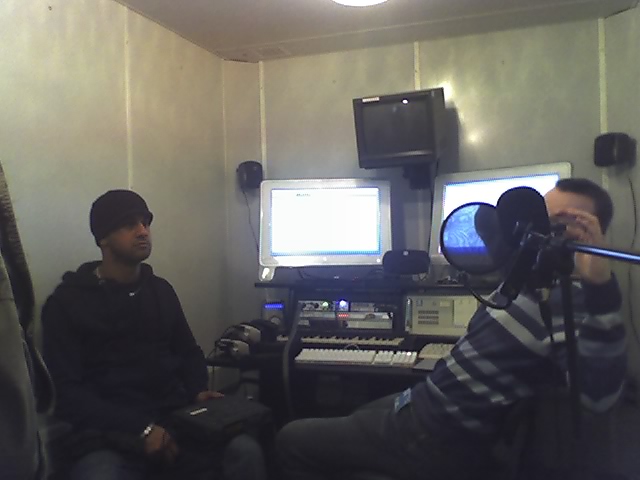
The next stage in the project was to record the sounds, this was done in one of the sound booths and we therefore learnt about some of the equipment involved in the recording of sound. As we had not yet learnt about how to use the equipment, we firstly recorded the sounds using a portable mini tape recorder. After this we were required to transfer this sound to a file on the computer and therefore we requested the help of a technician who taught us how to transfer this sound using audio jacks and a program named Sound Forge. After the sound was transferred to the computer we decided that it would be more appropriate to edit it in Adobe Premiere at the same time as the pictures.
In the final stages of editing, Sejpaal who was knowledgeable of Adobe Premiere put together the edited stills and then edited the sound by selecting the parts that we needed from the recording session. In this part of the project I observed what Sejpaal was doing in Premiere, this is so that I could add to the knowledge that I already had which is only a basic understanding of the program. I also attempted some of my own tests in which I practiced using the transition which was relevant to our groups project, this being the ‘page curl’ as we wanted to achieve the effect of the viewer reading a comic book.
I believe that although my contribution to this project may not have been much I did still have input on what went into the final product and this is reflected in my 65% effort grade which was award to me by the team. I believe that I was able to achieve a good relationship with the rest of my team which allowed me to learn new skills and to refresh my memory of old ones. I feel that although this project was largely focused on creating a good end product, its main target was to get people used to working in a team and learning new skills.
When reviewing the end production I believe that although it was visually very well done, the narrative left a lot to be desired, this is because I do not believe it was funny enough to warrant it being in the genre of comedy and this should have been more of a focus. As well as this I believe that we did not leave or self enough time to review the end product after we had produced it and it should have been tested on our target audience before being handed in, this could have notified us of any problem that may have occurred as well as being able to have feedback on the actual narrative.
In the future if I was to do another group project I would want to be more involved, therefore I will work on my technical skills and hopefully be able to be a bigger part of the final product. I would also ensure that as a group everyone could trust each other and be able to rely on them, as well as trying to involve everyone in every task as this would not only improve knowledge and skills, but team relationships which are very important for group projects.
Monday, November 27, 2006
Testing, Testing, 1,2,3…

Just a quick post, went in one of the sound booths on friday to record some sound for our group narrative work, needless to say it was wicked, the equipment was top of the range and we worked off 2 massive mac screens which were interconnected with each other, the whple proccess was a good learning experience.
Image Composition Meaning
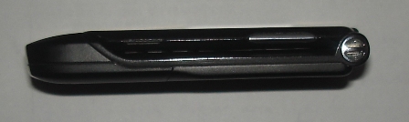
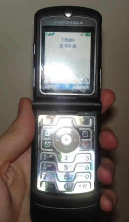
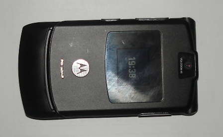
After thinking long and hard, i realised that the item that I own and like most is my mobile, which is a Motorola Black RAZR V3 and I believe it is the most aesthetically pleasing object because of its slim and sleek design which is very modern and attractive, inspired by today’s minimalistic lifestyle.
In its functionallity it is able to store and play MP3's, record videos, take pictures, browse the web with 'web 'n' walk', play games, send things via bluetooth, and most importantly make calls and recieve texts (obviously). Its much more suited to me than my other phone which could only take very low quality pictures because i like to be able to take lots of videos and pictures and this allows me the freedom to do so (baring in mind the limited space) meaning that i now have lots of videos and photos from it stored to my harddrive.
I think that this object communicates to me that with changes in technology, it is possible to have style and functionality at the same time without compromising either. It also communicates that technology continues to expand and more and more features will become available meaning that most pieces of equipment will become multi-functional tools.
Image Composition Meaning
After thinking long and hard, i realised that the item that I own and like most is my mobile, which is a Motorola Black RAZR V3 and I believe it is the most aesthetically pleasing object because of its slim and sleek design which is very modern and attractive, inspired by today’s minimalistic lifestyle.
In its functionallity it is able to store and play MP3's, record videos, take pictures, browse the web with 'web 'n' walk', play games, send things via bluetooth, and most importantly make calls and recieve texts (obviously). Its much more suited to me than my other phone which could only take very low quality pictures because i like to be able to take lots of videos and pictures and this allows me the freedom to do so (baring in mind the limited space) meaning that i now have lots of videos and photos from it stored to my harddrive.
I think that this object communicates to me that with changes in technology, it is possible to have style and functionality at the same time without compromising either. It also communicates that technology continues to expand and more and more features will become available meaning that most pieces of equipment will become multi-functional tools.
VAST
Hey just thought I’d post a links to a websites that I found whilst browsing the net, its called VAST which stands for ‘Visual Audio Sensory Theater’, it’s a flash site and I really liked the layout and design of it, heres a pic and a link to it, take a look see what ya think;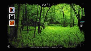

Monday, October 30, 2006
2 Short Films
I found this short film at a site called ‘atom films’ which is dedicated to short films. This film title is ‘Deviation’ and is a machinima film which is a genre of film that is created using a video game, this one comes from the game Counterstrike (an online pc game) and was made using voice actors from across America who never met in the real world. I think that I liked the fact that it seems like a simple way to create what I thought was a good short film and that is why I like the machinima genre of film, along with the fact that it means that people can make films based on games which is not that common in the film industry with the exception of films such as Resident Evil and Final Fantasy (although these are not machinima films, but films based on video games). The storyline I felt was the best point to the film as it was relevant to video games and as a person who plays video games I could relate to it.
This second film that I found on YouTube was titled Static and was of the horror genre, and I found that I liked its simple, yet effective style which allowed the story to develop well and I enjoyed how the narrative was non-linear, unlike many other short films. It was also done in a Japanese style horror, like films such as Ringu and Ju-On.
Subscribe to:
Comments (Atom)
